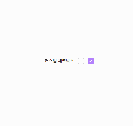
input 커스텀 정리(태그 구조로 분류)
input 커스텀 정리
내 입장에서는 기본 input을 사용하는 게 여러모로 편리하겠지만, 100중에 90은 디자인된 input이 주어진다.
나는 주로 label을 커스텀하는 방식을 많이 사용했었는데, 이는 아래와 같은 장단점을 가진다.
➡️ input + label의 구조 / label에 커스텀하기
input 뒤에 label이 오는 구조로 잡고, input은 {display: none;appearance: none}처리 후 label을 커스텀하는 방법
/* 숨긴 input 요소 */
input[type="checkbox"] {
    display: none;
    appearance: none;
}

/* 커스텀 label 요소 */
.custom-checkbox {
    display: inline-block;
    width: 20px;
    height: 20px;
    background-color: #ccc;
    border-radius: 4px;
    cursor: pointer;
    position: relative;
}

/* 체크 상태 스타일 */
input[type="checkbox"]:checked + .custom-checkbox {
    background-color: #4caf50;
}

/* 체크 표시 추가 (예: 체크 마크) */
.custom-checkbox::after {
    content: "";
    position: absolute;
    top: 50%;
    left: 50%;
    width: 10px;
    height: 10px;
    background-color: white;
    border-radius: 2px;
    transform: scale(0);
    transition: transform 0.2s ease;
}

input[type="checkbox"]:checked + .custom-checkbox::after {
    transform: translate(-50%, -50%) scale(1);
}
👍장점
1) label의 for와 input의 id에 동일값을 주면, 웹접근성을 지키면서 동시에 별도의 처리없이 input 사용이 가능하다.
2) 다양한 스타일을 줄 수 있다.
👎단점
1) input의 형태를 없애는 방법으로, input 요소의 기본 기능(예: 포커스, 키보드 내비게이션 등)을 별도로 처리해야 한다.
2) 기본적으로 제공되는 HTML5의 유효성 검사 메시지도 표시되지 않아, 별도로 유효성 검사와 메시지를 구현해야 한다.
➡️ label > input + span 의 구조 / label로 묶고, span에 커스텀하기
.custom-checkbox {
    /* display: none;
	appearance: none; */

    /* 시각적으로만 숨김처리를 해준다 */
    overflow: hidden;
    position: absolute;
    width: 1px;
    height: 1px;
    margin: -1px;
    clip: rect(0 0 0 0);
}
👍장점
1) 웹 접근성 유지: label 요소와 input 요소를 함께 사용하여 접근성을 유지할 수 있다. label 요소는 input 요소와 직접 연결되므로, 클릭 시 input 요소가 활성화된다.
2) 스타일링의 유연성: span 요소를 사용하여 체크박스의 스타일을 자유롭게 커스텀 가능하다.
3) 기본 기능 유지: input 요소의 형태를 없애지 않고 시각적으로만 숨김으로, 브라우저의 기본 유효성 검사 기능과 키보드 내비게이션 기능이 유지된다.
👎단점
1) input과 label 대신 추가적으로 태그가 필요하고, 스타일링이 필요하다.
기존에는 1번 방식으로 진행했는데, 사실 별도로 기능을 구현하는 것보다는 2번 방법으로 해 css만 수정해주는 게 훨씬 이득인 것 같다.